
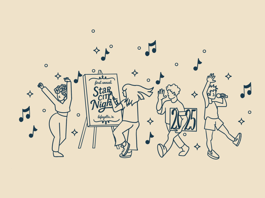
Featured Illustration
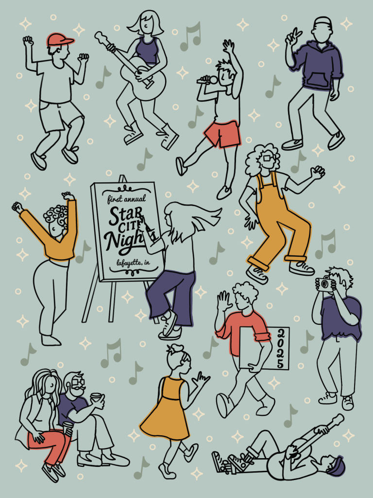
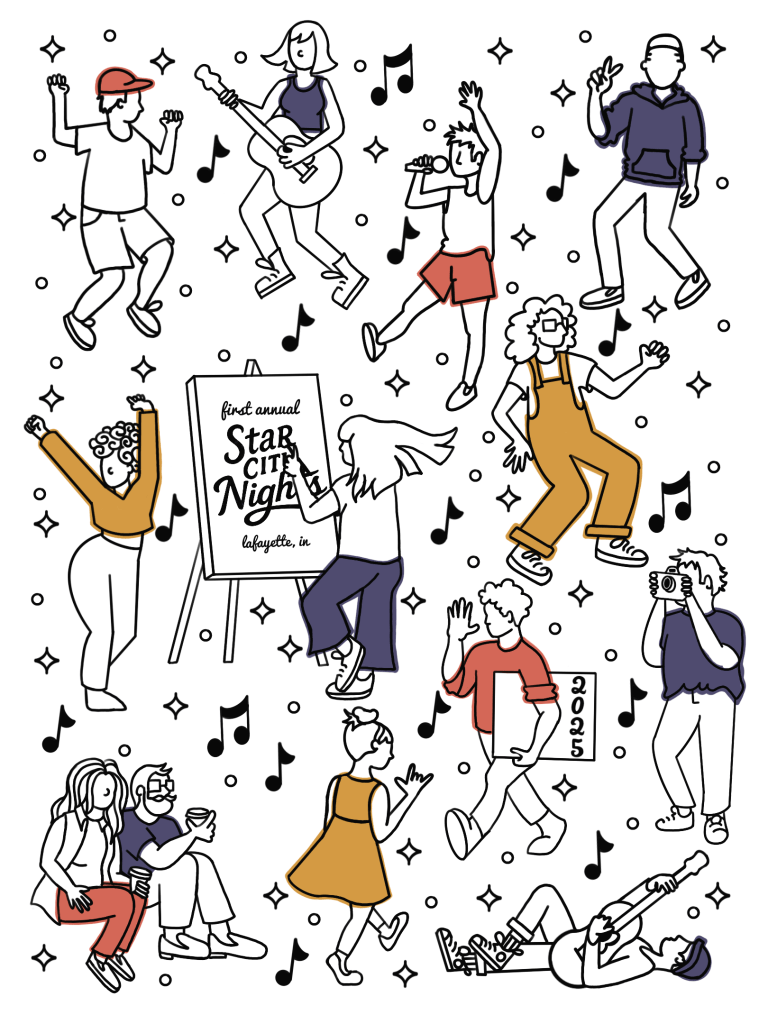
With the brand identity and logo in place, the next step was creating a feature illustration to anchor the inaugural year’s poster, merch, and digital promotions. The goal? To encapsulate the spirit of a night downtown, filled with music, movement, and creativity… without falling into tired festival tropes.
The illustration needed to go beyond simple decoration. It had to capture the feeling of a vibrant fall night downtown, full of creativity, music, and joy. It was also important that the visual tone felt playful and warm, while staying consistent with the brand identity I had just developed.
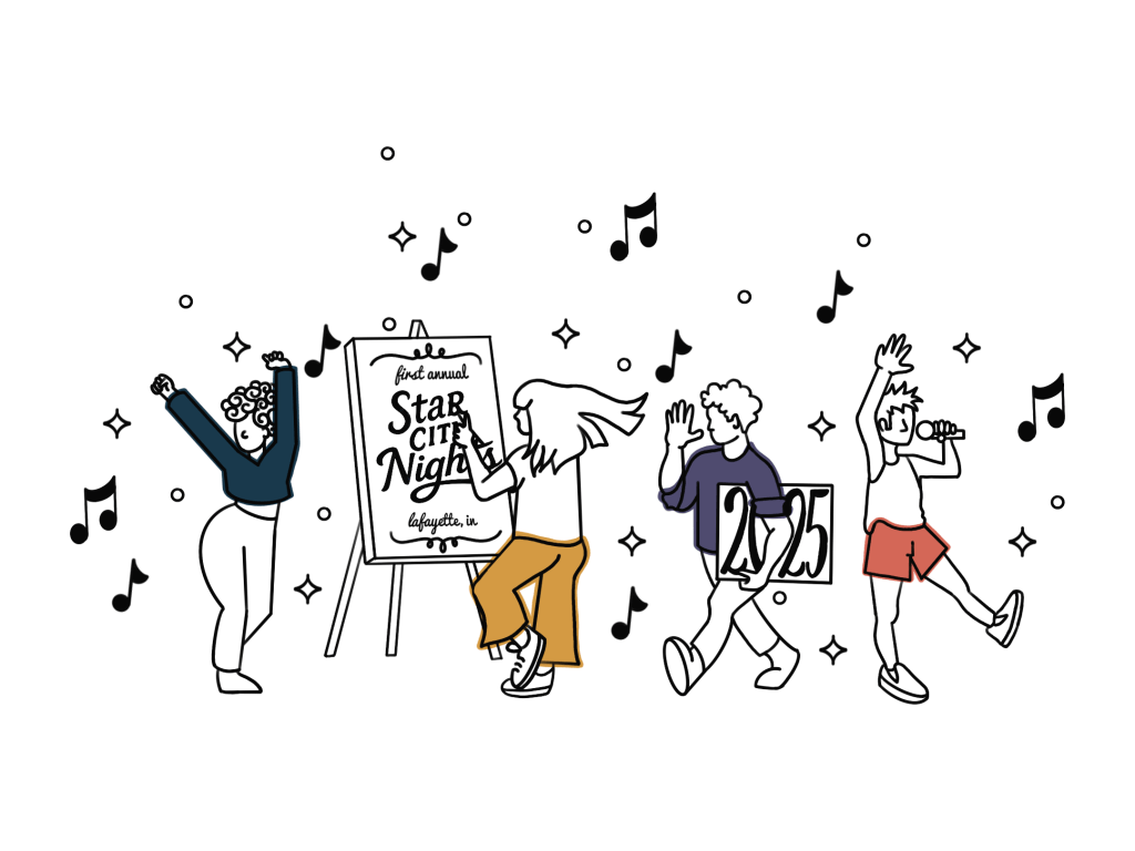
Instead of leaning into typical festival imagery (tents, stages, or nature scenes), I focused on a character-driven composition that celebrated people and atmosphere. The scene shows a diverse community dancing, mingling, and enjoying themselves amidst a whimsical smattering of stars.
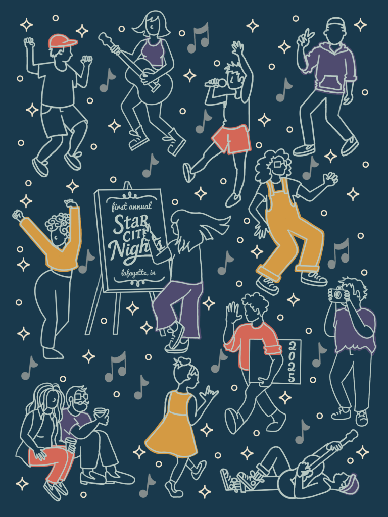
The limited color palette allowed the illustration to tie seamlessly into the rest of the festival’s visual system while keeping the artwork bold and versatile in various print formats.
Project Objectives:
The key objectives for the featured illustration included:
- Create a visually striking piece that draws people in ad communicates the vibe of the festival at a glance
- Make the illustration adaptable across formats (posters, flyers, digital assets, signage, and merch)
- Capture a sense of community, magic, and togetherness overall.
- Reflect the updated identity
Approach
For this piece, I wanted the illustration to feel expressive and alive, without overcomplicating the composition. I focused entirely on character, movement, and mood, using clean linework and a flat background to let the figures speak for themselves. By stripping away any detailed environment or background elements, the emphasis stays on the people: dancing, playing music, creating art, and connecting with each other. This minimal approach also keeps the artwork highly adaptable for posters, social media, and print materials, ensuring it would stay bold and legible across sizes.
The star motifs and strategic use of negative space brought just enough energy and atmosphere to suggest a lively night scene, without ever needing to draw the city around it. It’s a distilled version of the festival itself: vibrant, human, and full of creative energy.
Challenges
- Designing an illustration that felt full of energy without feeling cluttered.
- Making sure the artwork worked in both full-size posters and cropped digital formats.
- Finding the right balance of detail and simplicity to keep the illustration adaptable and clear at any scale.
Results
- A one-of-a-kind illustration that serves as the visual anchor for the 2025 Star City Nights festival
- Successfully used across promotional platforms with consistent visual impact
- Positive response from the organizers of the event, the Downtown Lafayette Business Owners Association, who felt the artwork reflected the soul of the event.
- A seamless extension of the new brand, helping the festival feel fresh, cohesive, and inviting.


“We had the pleasure of working with Jai Powell on the logo design for the DLBOA Star City Nights event, and we couldn’t be more pleased with the experience. Jai was incredibly prompt and responsive throughout the entire process, always meeting deadlines and communicating clearly. Their professionalism and attention to detail made the collaboration seamless from start to finish.”
– DLBOA, the Downtown Lafayette Business Owners Association
