
Brand Identity and Logo Design
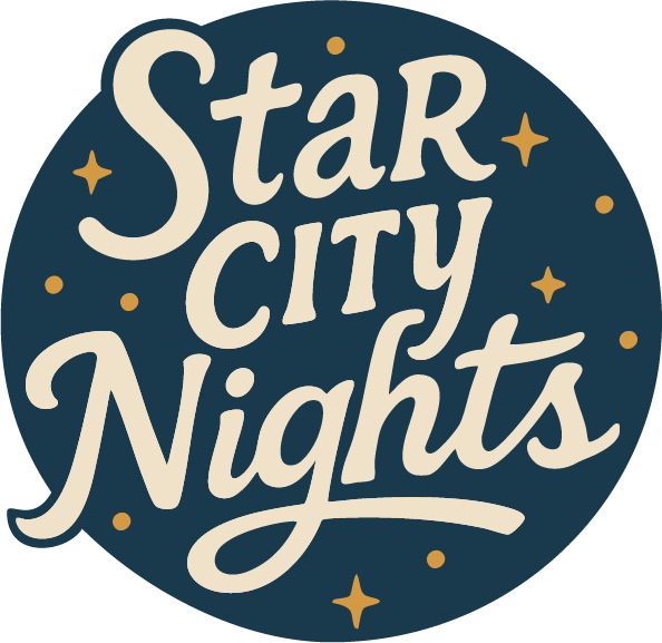
When Starry Night Music & Arts Festival transitioned to new hosts, I was brought into help breathe new life into the event, beginning with a complete rebrand and visual overhaul. The new name, Star City Nights, pays homage to the original event while distancing itself and referencing the city of Lafayette, Indiana’s historic nickname, “Star City.”
Project Objectives:
The key objectives for the festival rebrand:
- Rebrand the festival with a new identity that reflects its updated leadership, location, vision.
- Create a logo system that feels fresh, playful, and rooted in the idea of a magical downtown night in the city.
- Avoid overused imagery from the previous branding. Instead lean into a more refined typography, night themed abstract elements, and a vibrant community aesthetic.
- Develop a flexible visual system that can be used across digital and print platforms, including signage, merch, social media, and more.
- Appeal to both new audiences and returning attendees, blending familiarity with a clear step forward in tone and style.
- Lay the foundation for future creative assets, including illustration, wayfinding, and poster design.

Approach
As a previous attendee to the original Starry Night event, I was familiar with the overall aesthetic and feel. Still, I dived deeper into the event’s roots in my research, to understand what made the original special, and what needed to evolve under the new direction. I gathered visual inspiration from warm early autumn nights, downtown markets, and the creative energy of live music to guide both the mood and tone of the brand.
From there, I focused on building a flexible identity system grounded in a serifed vintage typographical logo, a soft nighttime-inspired color palette, and a spray of iconographic elements (stars) that could tie everything together. My goal was to go head first into urban warmth, movement and that soft autumn light.
Every element, from the typography to the background textures in the logo, were designed to feel cohesive across all formats, but still have enough character to stand on their own in different formats (the logo exists as both a visual and stand alone word mark while the stars are repeated in the featured illustration I created in part two of the project).
Challenges
- Reintroducing a familiar event under a new name meant striking the right balance between fresh and familiar. The identity needed to feel like a clean break from the past, while still keeping returning attendees feeling at home.
- Avoiding overused festival tropes and focused, instead, on building a brand language rooted in energy, color, and community, not cliches.
- Designing for flexibility across formats, from flyers, social media badges/banners and posts, meant building a logo and brand system that could scale, simplify and adapt without losing impact.
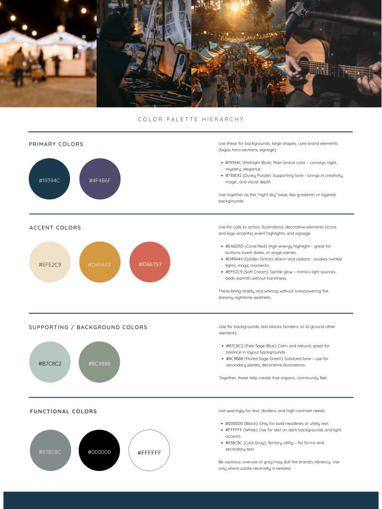
- Capturing the nighttime mood without becoming too dark or moody. The color palette had to feel vibrant and inviting, not heavy or too muted, even while embracing deeps blues and purples with those warmer tones.
Results
- A cohesive brand system that gives the festival a strong, recognizable voice across digital and print platforms, perfectly suiting for various marketing materials, signage, and future merch.
- A bold, flexible logo that scales well across use cases and stands out in both color and single-tone applications.
- A defined color palette tha captures the dreamy, electric mood of a night downtown, making the brand feel both magical and modern.
- Positive feedback from the organizers, who felt the new identity captured the heart of the event while giving it a more polished, professional feel.
- A solid visual foundation that allows for consistent expansion into future illustrations, social graphics, and other event-specific designs without straying from the core brand.
“Not only did Jai bring our vision to life beautifully, but they also offered thoughtful design insight that elevated the final product. They were flexible, open to feedback, and genuinely invested in making sure the logo reflected the spirit of the event. Beyond their talent and professionalism, Jai was simply a joy to work with—kind, courteous, and enthusiastic. We’re so grateful for their work and look forward to future opportunities to collaborate.”
– DLBOA, the Downtown Lafayette Business Owners Association
